This comprehensive guide will walk you through the installation, setup, and customization of your VoidcoreAI template, helping you build a sleek, professional, and engaging website for your AI or tech-focused business.
VoidcoreAI Pro Theme Documentation
Introduction
Customizing Your Website
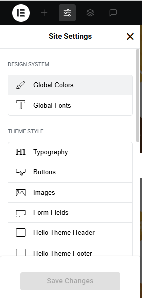
Global Settings
- Go to Elementor > Site Settings.
- Adjust typography, colors, and layout settings.
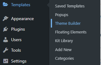
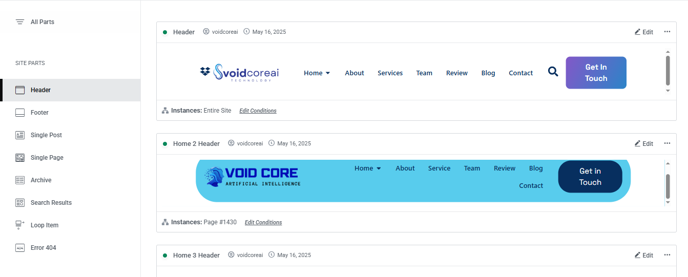
Header & Footer Setup
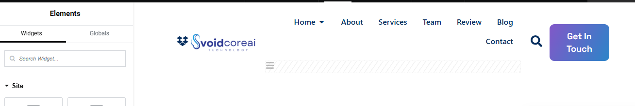
- Use Elementor Theme Builder to edit the header and footer.
- Customize the navigation menu, logo, and contact details.
You can drag and drop the elementor widget’s menu first. If you’d like, you can add items or simply drag each one, after which you can add a icon list from the widget and create my account and login page than apply a custom style from the style option.
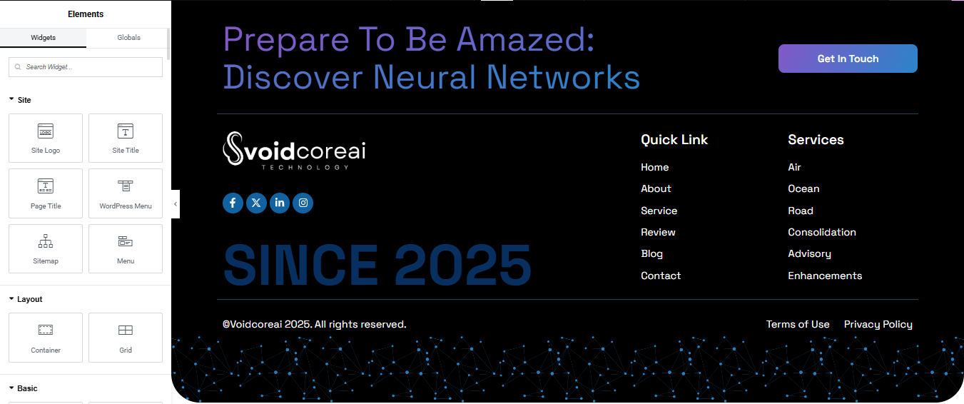
you can add newslatter form, timing, contact details, logo, menu and if you wish in footer, and create you best design.
Home Page Setup
Using Pre-Built Layouts
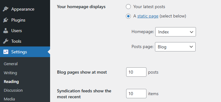
Navigate to Setting >> Reading
Choose the Static Page option.
Choose an existing homepage or create a new one.
Add The Section in home page using elementor
Add components such as these using the Drag & Drop Builder:
- Hero Section
- Technology
- about section
- our services
- Feature
- Projects
- Our Team
- Review
- Blog
- Contact
Main Hero Section
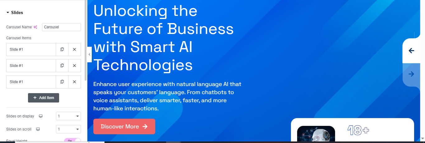
Insert the Carousel or Slider Widget
- In the Elementor widget panel, search for “Carousel,” “Slides,” or “Slider” depending on your plugin.
- Drag and drop the Slides or Hero Slider widget into the section.
Configure the Slides
- Carousel Name – Rename it for internal clarity (e.g., HeroSlider).
- Carousel Items – Add your slides:
- Click Add Item to create a new slide.
- Enter a Title and Description (like “Unlocking the Future of Business with Smart AI Technologies”).
- Add a Background Image or Gradient (like your blue background).
- Add a Button with a link and label (e.g., Discover More →).
Style the Slides
- Customize the Typography, Colors, Padding, and Alignment in the Style tab.
- Adjust Text Color to contrast with your background.
- Set the Background Overlay if needed for better readability.
Navigation & Behavior
- Enable or disable Arrows / Dots for navigation.
- Set Slides to Show = 1 and Slides to Scroll = 1 (as shown in your image).
- Enable Autoplay, Loop, or Fade Effect as desired under the Advanced / Settings tabs.
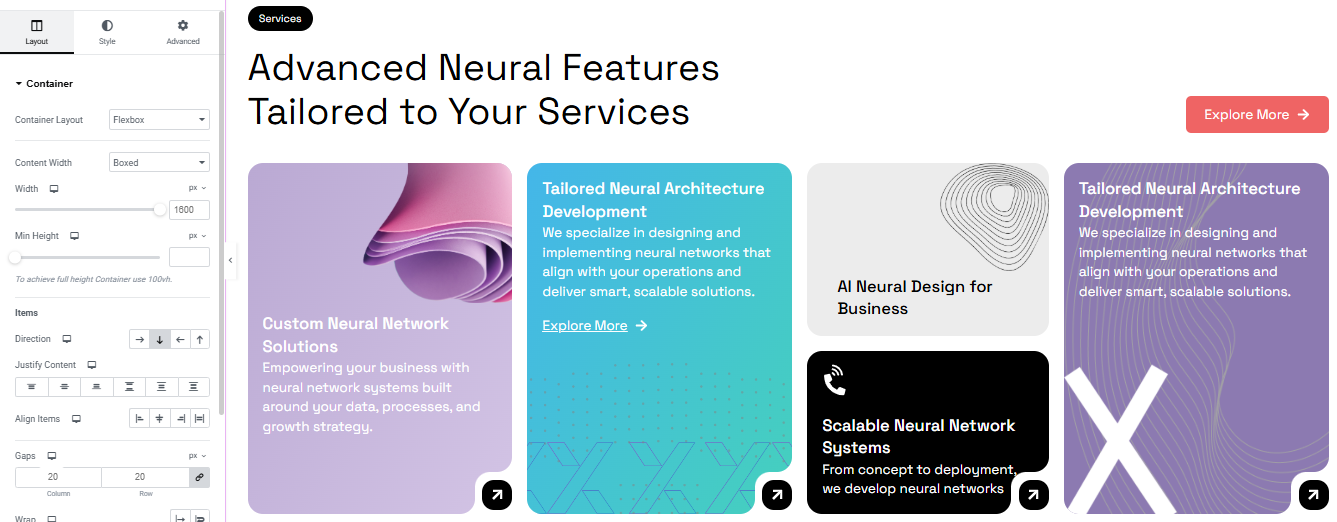
Technology Section
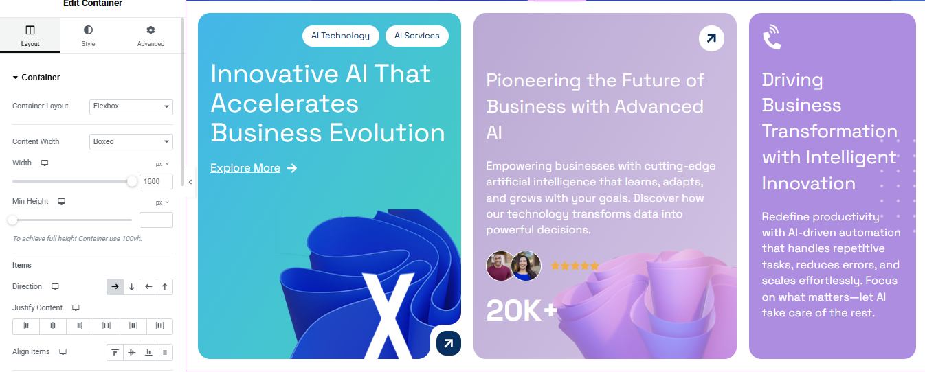
Add a Container
- In Elementor editor, click “+” and select Container.
- Set Container Layout to Flexbox.
- Set Direction to Horizontal (row) to display items side-by-side.
- Set Content Width to Boxed or Full Width as per your design.
- Optional: Set Width = 1600px, Min Height = as needed (e.g., 600px).
Add Inner Containers (Cards)
- Inside the main container, add 3 inner containers (1 for each card).
- For each inner container:
- Set Padding (e.g., 30px).
- Add a background color or gradient.
- Set Border Radius for rounded corners.
- Optional: Use box shadow for depth.
Add Content to Each Card
Inside each inner container (card), add the following:
- Card #1:
- Text Editor / Badge: (use Button or Text with styling)
- Heading:
- Text Editor:
- Button: “Explore More →”
- Image/Icon: Add your design illustration.
Style Your Section
- Use Style tab in each widget to adjust:
- Colors
- Typography
- Spacing
- Icons
- Shadows & Borders
About Us Section
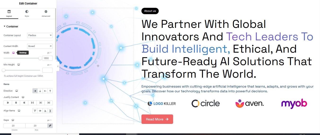
Add Two Inner Containers (Split Layout)
- Add two inner containers side by side:
- Left Container (for image or decorative background)
- Right Container (for text content and logos)
Design the Left Container (Decorative Image or Background)
- Click on the left container.
- Go to Style > Background:
- Choose Background Type: Classic or Gradient.
- Upload an AI-themed image, tech background, or SVG.
- You can also add motion effects from Advanced > Motion Effects.
Add Content to the Right Container
- Badge/Button:
- Add a Button widget or Text widget with “About Us”.
- Heading:
- Add a Heading widget with large, bold text
- Text Editor:
- Add a Text Editor widget below with supporting text.
- Button:
- Add a Button labeled “Read More →”.
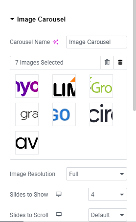
Add Logo Slider (Image Carousel)
- Drag the Image Carousel widget below your text content.
- Upload logos (e.g., circle, aven, myob).
- Set:
- Slides to Show: 3–5 (based on logo count).
- Navigation: Dots or Arrows.
- Autoplay: Yes (optional).
- Image Size: Medium or Thumbnail.
Style Everything
- Spacing: Add padding/margins where needed.
- Typography: Adjust font size, weight, and color.
- Container Background: Add a slight gradient or background pattern.
Services Section
Add a Container
- Drag a Container onto the page.
- Set the Container Layout to Flexbox.
- In the Layout settings:
- Direction: Vertical (default).
- Width: Adjust or keep responsive.
- Align Items: Center or Stretch depending on the design.
- Justify Content: Start.
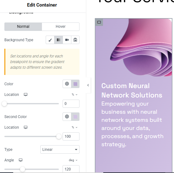
Add Gradient Background
- Select the container.
- Go to Style > Background > Background Type.
- Select Gradient:
- First Color: Choose a soft purple/pink.
- Second Color: Slightly different shade.
- Type: Linear.
- Angle: e.g., 120° for diagonal.
- Adjust location sliders if needed for smooth blend.
Add Image or Decorative Element
- Drag an Image widget to the top of the container.
- Upload the tech-style image or abstract 3D render.
- Set Image Size to Medium or Full.
Add Heading and Text
- Add a Heading Widget:
- Text:
- Style: Bold, large font size, white or light text color.
- Align: Center or Left (based on layout).
Add a Text Editor Widget:
- Description:
- Style it with lighter font weight and slightly smaller size.
Final Touches
- Padding: Add 20–40px padding inside the container.
- Border Radius: Optional—add 20px for rounded edges (Style > Border).
- Box Shadow: Add subtle shadow if you want depth.
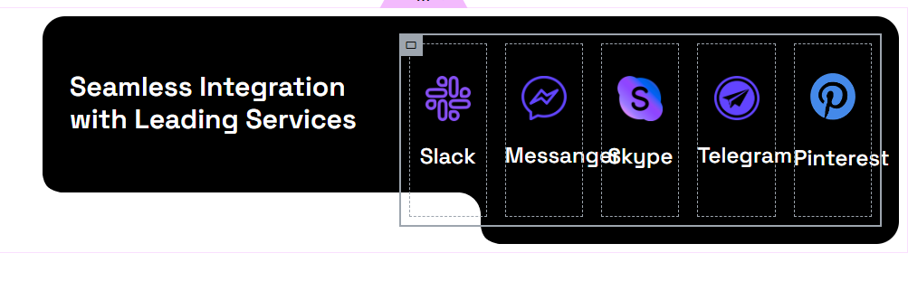
Add Main Container
- Drag a Container to the page.
- In Layout > Direction: set it to Horizontal.
- Content Width: Boxed or Full Width depending on your design.
- Set background color to black (#000000 or similar).
- Add padding (e.g., 30px).
- Enable Border Radius (e.g., 20px or more for rounded corners).
Left Column – Text Block
- Inside the main container, add a nested container (Column 1).
- Drag a Heading Widget:
- Text:
- Text Color:
- Typography:
- Adjust padding or margin to center the text vertically.
Right Column – Service Boxes
- Add another nested container next to the text (Column 2).
- Set layout to Horizontal (row) or use Inner Section if preferred.
- For each service (Slack, Messenger, Skype, Telegram, Pinterest):
- Add an Icon Box or Container with Image + Text.
- Use brand icons (via Font Awesome or upload SVG).
- Below each icon, add the service name.
- Style each box:
- Background: transparent or semi-black
- Border: 1px solid white or outline
- Padding: 20px
- Border Radius: match the style
- Icon color: Use each service’s branding color or white with a glow.
Feature
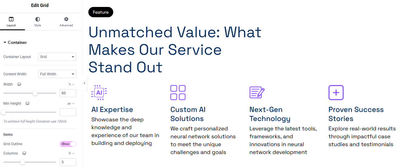
Add Heading & Label
- Above the Grid Container, add a new Container.
- Inside it:
- Add a Text widget or Button for the label “Feature” with black background and white text.
- Style: Padding, border-radius, small font.
- Add a Heading widget for:
- Use a modern, bold font and set color to dark navy.
- Use responsive typography (e.g., 40–50px on desktop, smaller on mobile).
- Add a Text widget or Button for the label “Feature” with black background and white text.
Add Feature Items
- Drag an Icon Box widget (or create manually with Icon + Heading + Text).
- Add:
- Icon: Use Elementor’s icon library or upload SVG.
- Title (e.g., “AI Expertise”).
- Description text.
- Style each:
- Icon Color: Purple (#8A6DF1 or similar).
- Title: Bold, dark blue.
- Description: Light black/gray.
- Spacing:
- Add padding to each item.
- Align icons and text to center or left, based on design.
- Optional: Add hover effect or box shadow to icons for interactivity.
Style Settings
- Icons:
- Size: Around 40–60px.
- Add padding/margin around the icon.
- Typography:
- Title: 18–20px, bold.
- Description: 14–16px, normal weight.
- Spacing:
- Ensure consistent vertical spacing between items.
Project Section
Add a Two-Column Section
- Create a new Container (Flexbox Container or Inner Section if using older version).
- Set layout to Horizontal (Row).
- Column 1: For sticky “Projects” label.
- Column 2: For project content (image, heading, description, button).
Setup Sticky Label Column (Left Side)
Inside Column 1:
- Add a Button or Text Widget for the label:
Text: Projects - Style it:
- Background Color: White or Light Gray.
- Text Color: Black or Dark Blue.
- Padding: 10px 20px.
- Border Radius: 25px (pill shape).
- Font Size: 14–16px, bold.
- Go to Advanced > Motion Effects:
- Sticky: Top
- Sticky On: Desktop (optional for mobile)
- Offset: 50px (adjust as needed)
Add Project Content (Right Side)
Inside Column 2:
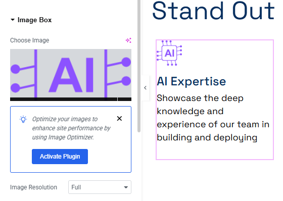
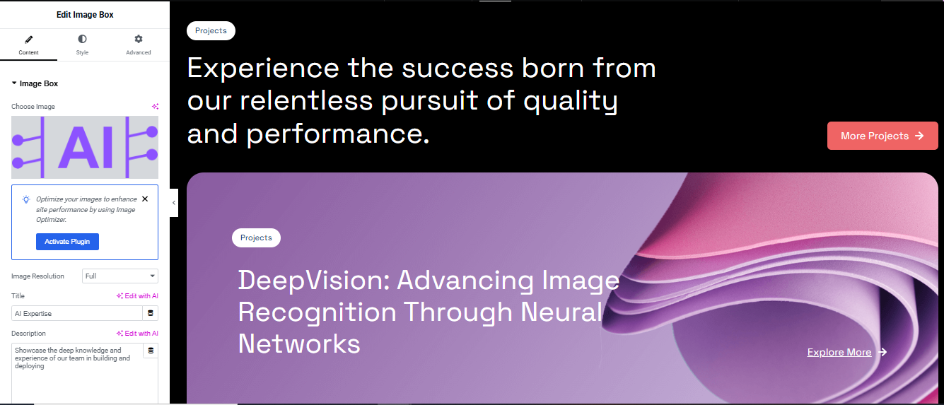
- Use Image Box widget, or create manually:
- Image: Upload or choose relevant project visual.
- Heading:
Example: DeepVision: Advancing Image Recognition Through Neural Networks - Description:
Example: Showcase the deep knowledge and experience of our team in building and deploying… - Button:
Text: Explore More → or More Projects →
- Spacing: Add margin between multiple project boxes (e.g., 40px).
Style the Project Content
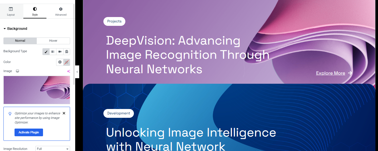
Background:
- Use Gradient or Image background to enhance visuals.
Typography:
- Heading:
Font size: 32–40px desktop, 24px tablet, 18–20px mobile
Weight: Bold, Color: #0D1B2A (Dark Navy) - Description:
Font size: 16px, Color: #444 or #666
Button:
- Background: #F04E4E (Red), Text: #fff
- Border radius: 20px, Padding: 10px 20px
Team Section
Add Heading & Label (Left Column)
Inside Left Column:
- Use a Text Editor or Button widget.
- Text:
- Style:
- Background: Black #000
- Text Color: White #fff
- Padding: 8px 20px
- Border Radius: 20px
- Font Size: 12–14px, Bold
- Main Heading:
- Text:
- Font: Bold, Modern (e.g., Poppins, Montserrat)
- Font Size: 40–48px (desktop), responsive sizes on tablet/mobile
- Color: Dark Navy (#0A2C52 or similar)
- Team Count:
- Add a Heading widget or Text Editor:
- Text: 260+
- Style:
- Font Size: 60–80px
- Weight: Extra Bold
- Color: Transparent with blue outline (via text stroke if using custom CSS)
- Subtext:
- Text:
- Font: 16-18px, medium weight
- Explore Button:
- Text: Explore More ↑
- Border: 1px solid navy
- Text Color: Navy
- Background: Transparent
- Padding: 10px 25px
- Border Radius: 6px
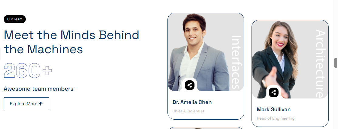
Add Team Member Cards (Right Column)
- Image Box Widget
- OR Create manually with Image + Name + Title + Overlay Icon + Label
For each Team Member:
- Image: Upload photo
- Add border radius: 12–16px
- Overlay Label (Vertical Text):
- Name (Heading):
- Text: e.g., Dr. Amelia Chen
- Font: Bold, Size: 18–20px, Color: Dark Blue
- Position (Text):
- Text: e.g., Chief AI Scientist
- Color: Light Gray, Font Size: 14–16px
- Overlay Icon:
- Use Icon widget or a button (e.g., eye or share icon)
- Style:
- Shape: Circle
- Background: White
- Icon Color: Black
- Size: 36–40px
- Position: Absolute, bottom left (using Advanced > Positioning)
Repeat for Multiple Cards
- Use a Grid layout or repeater (custom loop) to duplicate multiple cards
- Ensure consistent spacing and alignment
- Optional: Add hover effects (zoom image, show more info, etc.)
This section effectively conveys the achievements and credibility of the pet care service, making it engaging and informative for visitors. 🐾🚀
Review Section
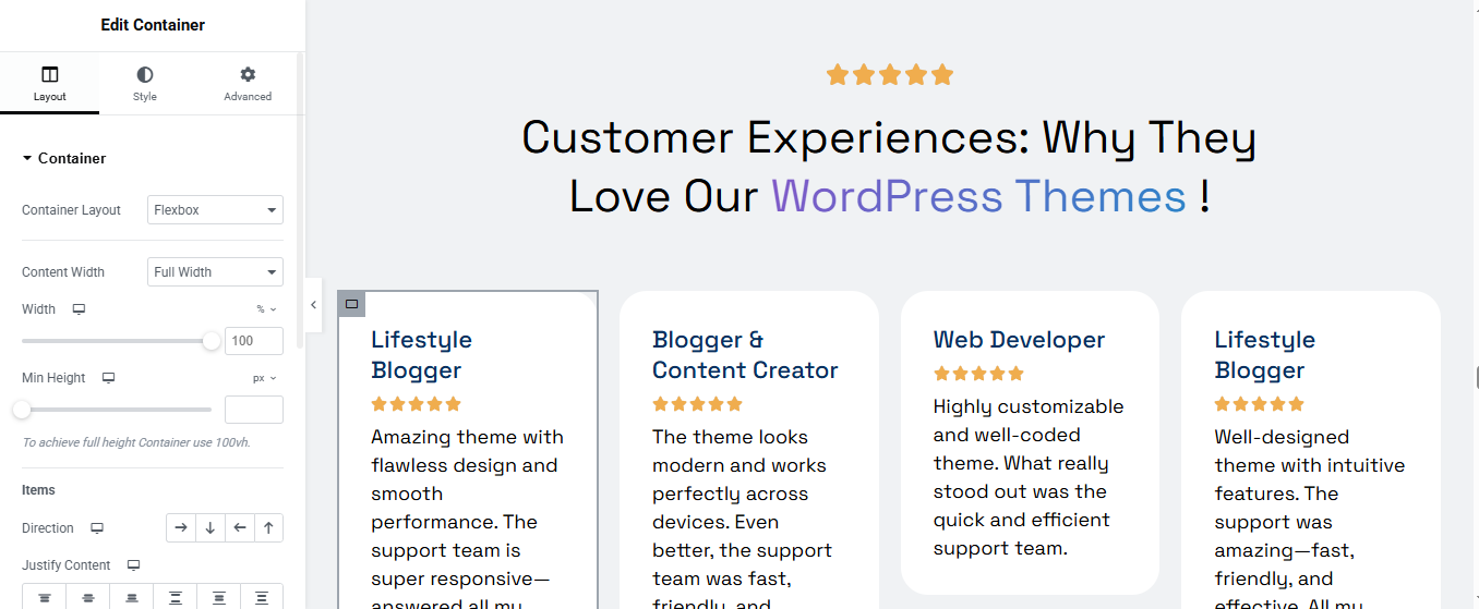
Add Section Heading and Subtitle
A. Star Icon Row
- Use a Star Rating widget (or Icon widget with 5 stars)
- Align: Center
- Star Color: #F6B100 (or any gold color)
- Size: 20–24px
B. Main Heading
- Text:
- Style:
- Font: Bold, Clean (e.g., Poppins, Inter)
- Size: 36–48px (desktop)
- Color: Black/Dark Navy
3. Add Review Cards
- Direction: Row
- Wrap: Yes (so cards stack on mobile)
- Add multiple inner containers or use repeater widgets
For Each Review Card:
- Use a Container or Inner Section with the following:
- A. Reviewer Title
- Widget: Heading
- Font Weight: Bold
- Font Size: 18–20px
- Color: Navy or Dark Blue
- B. Star Rating
- Widget: Star Rating
- Count: 5 stars
- Color: Gold
- Size: 16–20px
- C. Review Text
- Widget: Text Editor
- Font Size: 14–16px
- Color: Dark Gray or Soft Black (#333 or #444)
- D. Style the Review Card Container
- Padding: 20–30px
- Border Radius: 16px
- Background: Light Gray or White
- Shadow: Subtle Box Shadow (rgba(0, 0, 0, 0.08))
- Max Width: 280–300px
- Margin Between Cards: 16–24px
Blog Section
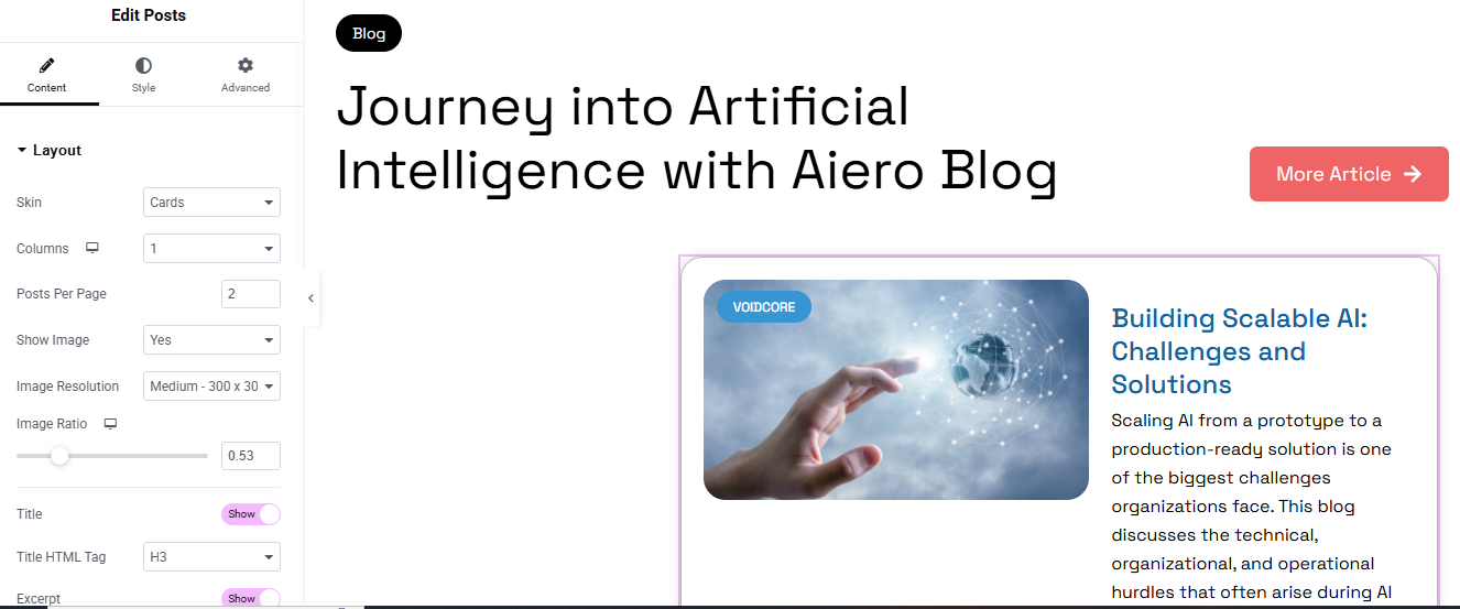
Add the Heading & Button
- A. Main Title
- B. “More Article” Button
- Style:
- Background: Red (#F1535C or similar)
- Text: White
- Border Radius: 10–20px
- Padding: 12px 24px
- Style:
Add Posts Widget
- Skin: Cards
- Columns: 1 (for vertical stacking)
- Posts Per Page: 2
- Show Image: Yes
- Image Resolution: Medium (300×300 or 300×200)
- Image Ratio: 0.53 (for custom image shape)
- Excerpt: Show (limit to 20–30 words)
4. Style the Cards
- A. Card Container
- Padding: 20–30px
- Border Radius: 16px
- Border: Light border or subtle shadow
- Background: White or very light gray
- B. Image Style
- Border Radius: 12px (matches the card)
- Position: Left side
- C. Category Badge
- Style:
- Background: Blue or gradient
- Text Color: White
- Padding: 4px 10px
- Border Radius: 50px or 8px
- Position: Top-left of image
Contact Section
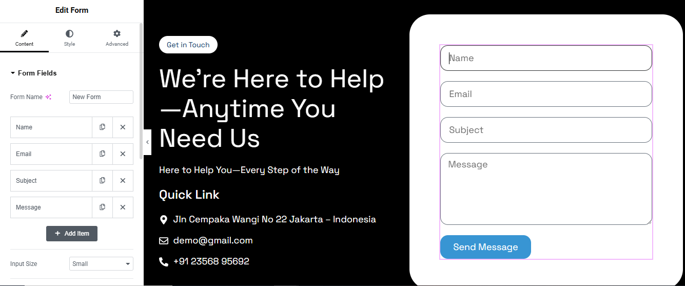
Section Structure
Left Side:
- Contact Heading
- Brief message or CTA
- Contact info (phone, email, address)
Right Side:
- Contact form (Name, Email, Message, Submit)
Left Column – Contact Info
- A. Heading
- B. Subheading / Text
- C. Contact Details
- Address
- Phone
- Style:
- Icons: Left aligned
- Spacing: 10–15px between items
- Font Size: 16–18px
Right Column – Contact Form
- Form Fields:
- Name (Text)
- Email (Email)
- Message (Textarea)
- Submit Button
- Styling:
- Field Width: 100%
- Padding: 12px
- Border Radius: 8–12px
- Text: White